What’s the difference between CMYK and Spot Printing?

At Streamline we still proudly remember our roots. Print is a big part of where we came from, and still a big part of our business today. Our team have the expertise to help you with your next print project and answer any questions you may have. In this blog, we talk through the difference between CMYK and Spot printing.
Commitment can be a scary thing – and print is a medium that requires a healthy dose of it. Diligently proofreading every last word on your artwork, making sure there’s no Photoshop faux pas, double (or quadruple) checking that all the details are correct for just a few potentially nerve-wracking examples. Taking the plunge and sending off those final artwork files to print can be a daunting prospect that’s not for the faint of heart. But what about the actual printing itself?
Do you know when to opt for the four-colour process, and when’s best to choose spot printing?
What’s the difference?
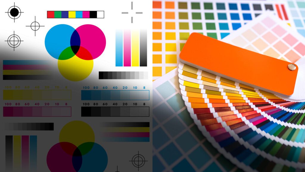
Well, the fundamental thing that distinguishes these two methods of printing is how your artwork files are set up. Four colour process is also known as CMYK (which stands for the colours cyan, magenta, yellow, and black). It works by laying down these four colours in a dot pattern that, when arranged in a certain format that corresponds to your lovely poster/brochure/leaflet can appear to the human eye as the full spectrum of colour. Newspapers use this technique. The next time you sit down to peruse the headlines, look a little closer and you’ll see it in action.
Spot colour takes a different approach. Here, each colour is individually mixed prior to printing meaning that what you get is a ‘truer’ version of the desired colour rather than one comprised of four fundamental shades. The Pantone matching system is one such system and is perhaps the best-known standard for spot colours. Their ‘paint chart’ style system is a delight to look over, featuring almost every imaginable colour – even metallics and neons (both being very on trend right now).
Making a decision
This might make it sound like the spot colour technique is more accurate, and therefore always the ‘truer’ and therefore more superior choice. In actuality, it has its limitations. For instance, CMYK is the only way to print in full colour. It can capture the full spectrum of colour, something that spot simply can’t do.
Spot colours are also specialised, meaning that your print project is limited to the total number of colours that can be used on a press. That said, Spot colours are sometimes better for branded materials. They produce brighter and offer a greater degree of uniqueness than CMYK can, meaning brand consistency right the way through your print run.
On the downside, CMYK struggles with things like matching certain shades, it’s less intense in solid areas of one colour and printing fine lines. Both these shortcomings are down to its ‘dot’ system. If budget is a factor, CMYK may well be exactly what you’re looking for. Because it can be digitally produced, it tends to be more economical for short runs or smaller items when compared to spot.
If you’re struggling to find the right colour, or Pantone match your print there is also the option for CMYK plus a spot print using an overlaid process- but that’s a whole other blog!
Clearly, there are pros and cons to each technique and we hope this quick run-through of each process has helped if you’re in a quandary about which way to go with your print project.
If there’s still something you’re not sure about we’re always happy to chat and try and give more clarity on the topic. We’ve got over four decades of experience in the industry – so commitment isn’t so daunting for us! Contact our experts today.