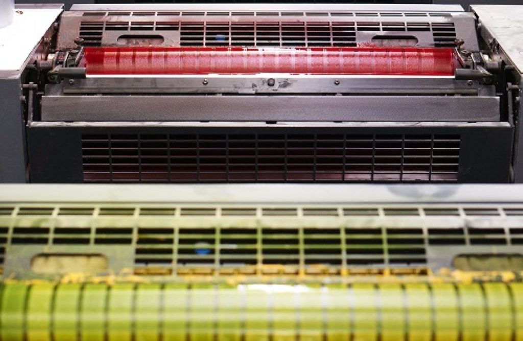
Common print practices

How to make sure your marketing print job runs smoothly.
It was only a few years ago that we were hearing a lot about how ‘print is dead’ and digital media was taking over. Well, as it turns out there’s no need for a funeral at all… print was simply taking a breather. In fact, it may be a case of ‘absence makes the heart grow fonder’. As this digital age progresses, more and more of us are looking for a respite from the screens and their endless notifications. Perhaps this is why lots of businesses and their clients are rediscovering the charm that printed media can have, when done properly. ‘Properly’ being the operative word here. We put our heads together to explain a few technical terms that’ll help you keep the quality on your next print job in check.
Vector-based programs
This might sound scary to non-designers out there but it’s the best way to get a beautifully crisp finish on your printed collateral. A vector-based program (like Adobe’s InDesign) is a piece of software that a designer will use to create the visuals of your brochure, flyer, business card etc. It uses sophisticated mathematical theory to make sure there’s no blurry, pixelated outlines and everything appears nice and sharp – something you can’t guarantee with non-vector-based software such as .jpg or .png. If in doubt, ask a designer.
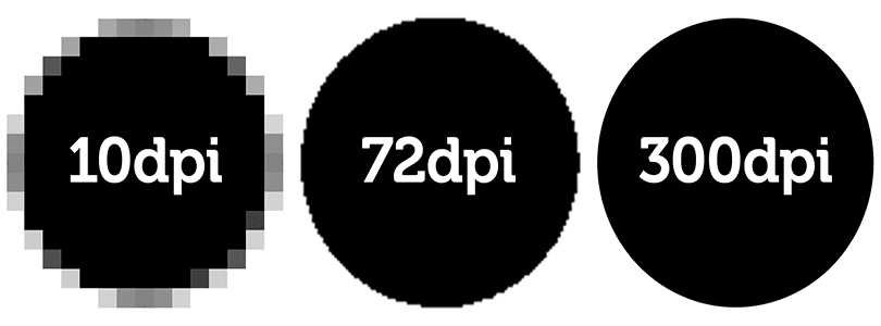
‘DPI’
DPI stands for ‘dots per inch’ and is again related to the final resolution of whatever you may be printing. It all depends on what size your work is being printed but if the DPI is too low the resolution of your image may be of poor quality – not something that reflects well on anyone’s brand! This is the reason that print files are often very large in size. Again, this is part of the ‘set up’ and usually taken care of by a designer who will take this into consideration before anything is sent to print.
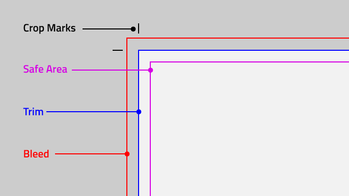
Bleed and trim
Bleed refers to the area around the edges of your designs. An area of usually around 3 to 5mm, its purpose is to provide an area for you to ‘bleed’ your design into meaning that when the product is cut to finished size you’ve already compensated to avoid an unintentionally cheap looking white border. It essentially gives the printer ‘overlap’ space to account for movement of the paper or any inconsistencies with the design that might crop up.
Trim refers to the very edge of the final print, after the bleed area has been chopped off. A good designer will be aware of the need to leave plenty of space between this area and any text or other important content that might need to be included on the finished product.
Choosing the stock
Making sure you’ve got the right stock (type of paper) for the job is an absolute must. It’s all to do with weight and texture. Generally, the heavier the paper, the more premium the feel. The weight of paper is measured in ‘gsm’ which refers to how many grams there are per square meter of any particular stock. Whilst choosing the right paper is often a decision determined by budget, it’s also a subjective choice that should tie in with your brand and the job your printed material has to do. Your printer should be able to provide you with samples to help give an idea of what the end result might feel like.
Oh, and not to forget the difference between CMYK and spot colours… but that’s a matter for another blog.
We hope this guide helps give you a better idea of all the things that you need to consider in order to make sure what’s on your computer monitor produces that which comes out the printer accurately. As always, our experts and their extensive experience are on hand to chat through any printing queries you might still be in the dark about – so don’t hesitate to drop us a line if you think we can help!