Marketing Alchemy for 2019: Metallics

Heavy metal marketing - a new trend
One of the best things about working in the world of marketing is that you’re often the first to notice new trends coming in and changing the status quo. There’s something amazing about seeing a new technique or style take off and evolve – and one of our recent favourites has most definitely been that of metallics.
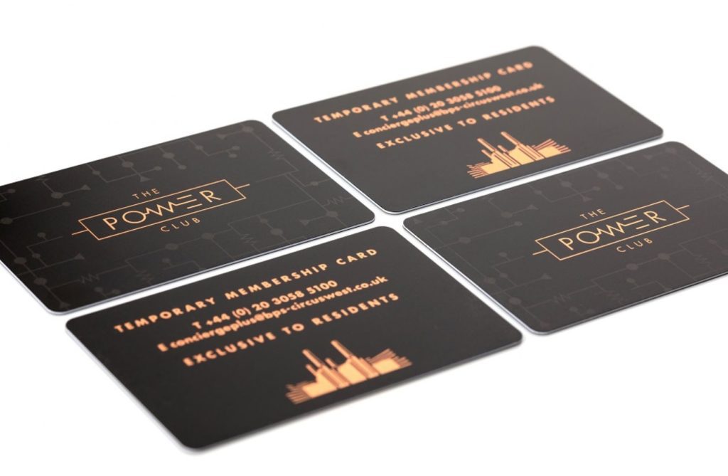
Yes, it seems like the days of using a monochromatic palette to summon that feeling of reserved classiness are over. Mixed metallics like copper, rose gold and silver were once a bit of a faux pa, but now it seems that the design influencers have given their approval to mix these incredible new textures on everything from print to branded merchandise. We’re big fans of this new trend too.
What makes the use of metallics so powerful? Well, part of it may well be that it was once so unusual to see rose gold embossed on a piece of packaging. When marketing and branding is at its best, the thing it’s applied to (be it something you can hold in your hand or simply a logo) is made to stand out. It’s as if when certain styles drop off the radar or fall out of fashion they eventually build potency from sheer absence, then once they’re boldly put to use again they have much more cut-through – simply because people aren’t used to seeing them.
The warm textures of copper, gold, brass and rose gold have always had an association with more premium products, nothing new there. But this recent renaissance that metallics have enjoyed uses a certain minimalistic rawness that also gives a sense of richness, depth and contemporary colour. All without fear of a multi-tonal overload.
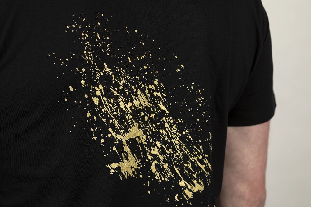
The reflective qualities of metallics offer a lushness and interaction with light that plain colours can’t. There’s plenty of finishes to choose from too: matt, hammered, polished, oxidised, painted. That’s not to mention the number of textures that they pair with.
We’ve also noticed that designers are tending to partner up their metallics of choice with natural substances like wood, poured concrete and marble.
In an interview for Pantone’s website, designer and founder of Chicago-based packaging and branding agency Damen Jackson, talks in depth about how he and his team employ metallics in their work. For him it’s all about ‘premiumisation’ and making certain products ‘pop’ when they hit the shelves. Read all about his approach to using metallics here.
Of course, if you’d like to make the most of our 40-years’ worth of experience in cutting-edge designs, we’re always keen to chat.